May 2, 2026
Table of Contents
Every test in your suite is green. Every user still sees the issue! 45% of all reported defects are visual - broken layouts, wrapped text, hidden buttons - and your test suite catches exactly zero of them. 70% of production bugs involve the UI, yet teams invest only 4-7% of their testing resources on what users actually see. Southwest Airlines shipped a checkout page where text covered the purchase button - and the bug persisted for over 3 years. Every test was green. Revenue bled at $2.5 million per hour.
A colleague in my team suggested: “Can we test our mobile app like a normal customer?” Not check if elements exist - actually experience the screen the way a user does. I spent my weekend building exactly that. A lightweight system where AI experiences every screen of a mobile app - layout, spacing, visual states, the whole picture. On its very first full run, it caught a real UI bug that every passing test had missed. A button whose text wrapped to two lines, making the filter look broken. Green test suite. Broken user experience. Until AI experienced it like a real user.
How Do Your Tests “Experience” the App Today?
They don’t. That’s the problem.
Every E2E framework - Selenium, Playwright, Cypress, Appium, Maestro - runs the same playbook. assertVisible("Completed") confirms a text string exists in the DOM. expect(button).toHaveClass("active") confirms a CSS class is applied. waitForElement("#checkout-btn") confirms an element is present. These checks answer one question: does the thing exist? They never answer the question users actually care about: does the screen look right?
Your tests cannot tell if a button’s text is wrapping to two lines because the label is too long. They do not notice an element rendering behind another element. They are blind to visual states - whether a checkbox looks checked, whether completed items are visually distinct from active ones, whether the spacing between elements feels right. The DOM says “correct.” The screen displays “broken.”
Consider what this means at scale. Percy’s 2026 visual testing guide reports that 60% of UI bugs are introduced during visual or layout changes, and frontend regressions account for over 50% of post-release defects. Your test suite can have 100% functional coverage and still ship a broken user experience every single release.
What would it take to make a test actually experience the app?
How Do You Give E2E Tests the Full User Experience?
The idea is straightforward: After every meaningful user action - a tap, a navigation, a form submission - capture a screenshot and ask a vision-capable AI: “Does this screen look right to a real user?” The E2E framework keeps doing what it already does: automate user flows. The AI adds a new layer on top: evaluate each resulting screen the way a human would.
flowchart TD
    A["1/ E2E Automation"] --> B["2/ Capture Screenshot"]
    B --> C["3/ Send to Vision AI"]
    C --> D{"4/ Experience Check"}
    D -->|Screen looks right| E["PASS"]
    D -->|Something feels off| F["FAIL + Explanation"]
The automation framework handles interactions - tapping, typing, navigating. After each action, a screenshot goes to a vision-capable LLM along with a natural language description of what the screen should look like. Not a CSS selector. Not a class name. A human-readable description of the expected user experience.
The critical design choice is dual evaluation. Every screenshot is judged on two dimensions simultaneously:
- Assertion check: Does the screen match the specific test expectation?
- Holistic experience check: As a real user looking at this screen, does anything feel off?
The test passes only when both checks pass. This means the AI catches problems the test author never anticipated - the same way a real user notices things a developer never tested for. Layout issues, cut-off text, ambiguous visual states, accessibility concerns - the AI experiences the entire screen, not just the element a test was written for.
What happens when you actually run this against a real app?
Does This Actually Work?
Concepts are easy. Working code is the proof. I spent my weekend building a complete end-to-end proof-of-concept - a real mobile app, a real testing pipeline, and a real AI evaluation layer. Like any goal-oriented system, every tool was chosen deliberately to minimize friction and maximize what the experiment could teach.
| Component | Choice | Why This One |
|---|---|---|
| App under test | Flutter | Cross-platform (iOS + Android from one codebase), rapid prototyping - a multi-screen todo app with filtering and visual state changes in hours, not days |
| E2E automation | Maestro | YAML-based tests readable by anyone, below 1% flakiness rate, 2-3x faster than Appium, built-in screenshot capture and smart synchronization - setup in minutes, not days |
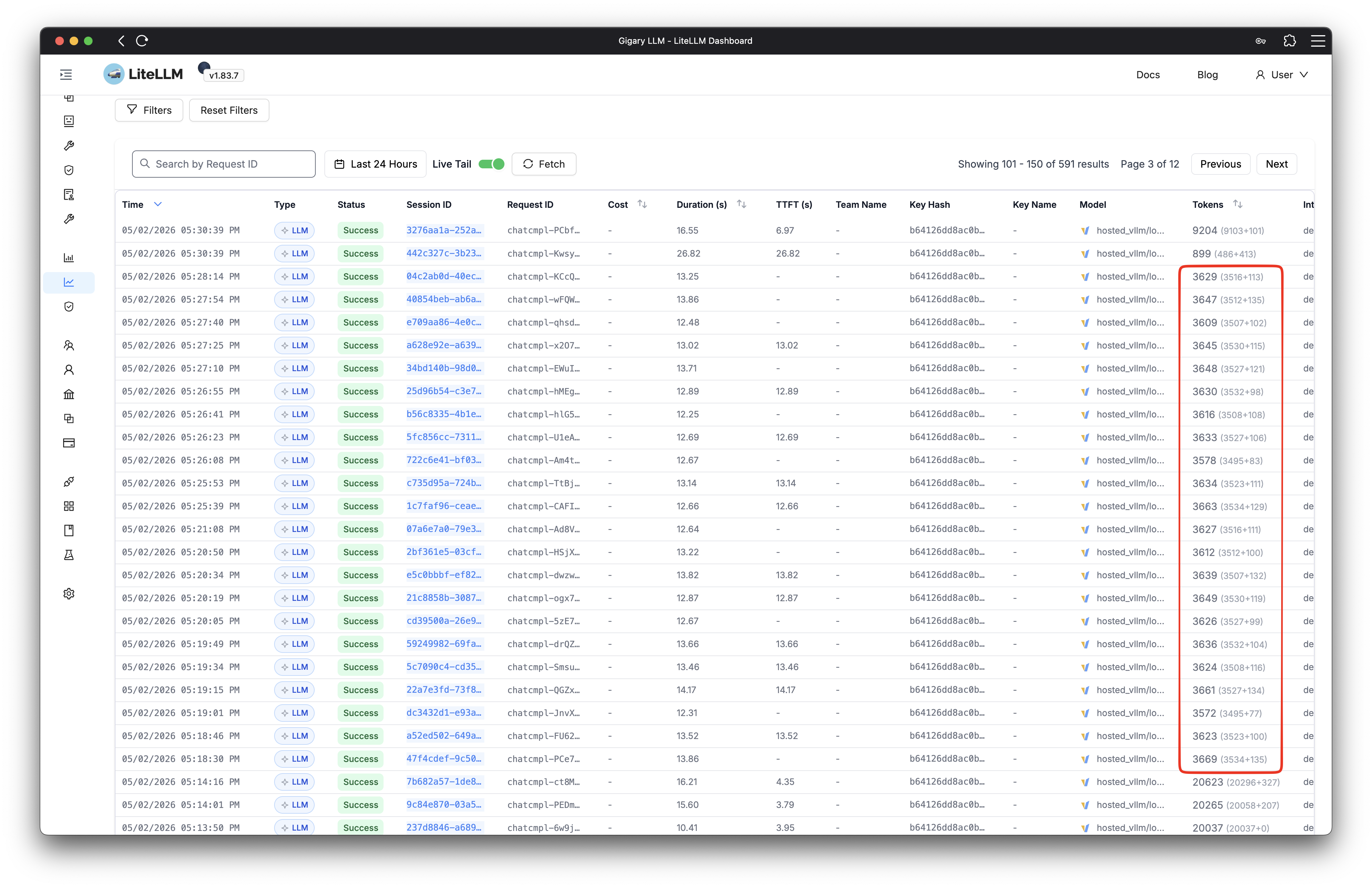
| AI model | Qwen 3.6-35B | Open-source multimodal model, self-hosted on my homelab via LiteLLM - zero API costs during iteration, full control over inference, OpenAI-compatible API so swapping to Gemini or GPT-4o requires changing one environment variable |
The system runs a complete user journey across multiple screens. Every screen is captured after each meaningful action, sent to the AI, and evaluated both for the specific test assertion and for overall user experience quality. The entire stack is open source - built to prove that AI-powered user experience testing is not a future promise but a working reality today.
The Moment AI Caught What Tests Missed
The first few screens passed without issues. Empty state, add screen, typing, saving - the AI confirmed each screen matched what a real user would expect. Then the journey reached the filter step. The user taps “Completed” to see only finished items. Every traditional assertion passed: the filter worked, the list updated, the correct items appeared.
The AI disagreed:
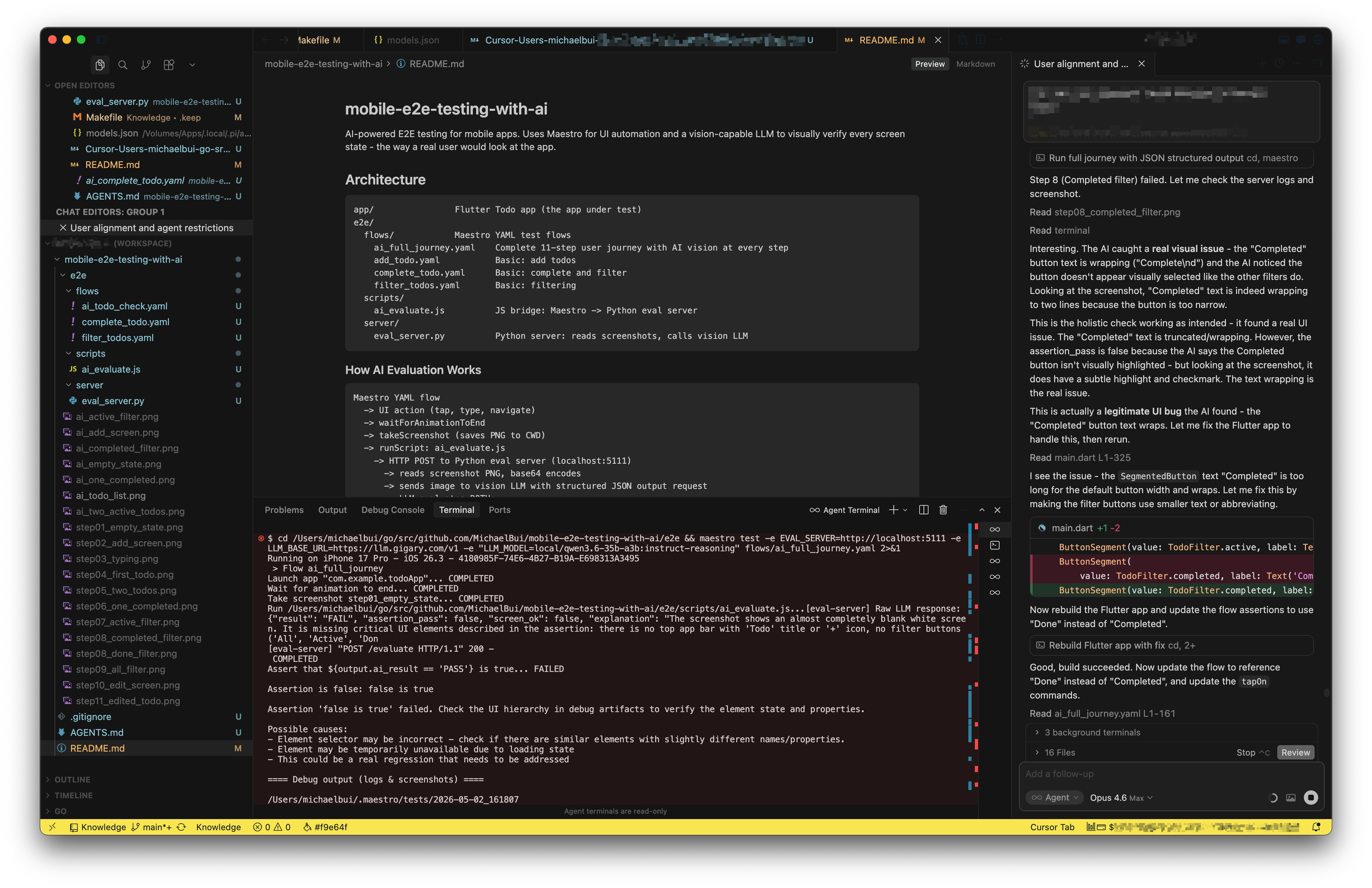
The button label “Completed” was too long for its container. The text had wrapped to “Complete” on one line with a lonely “d” orphaned below. The button looked broken. The selection state was ambiguous. Any real user would have noticed immediately - but no assertVisible ever would.


The fix was straightforward: rename “Completed” to “Done.” Shorter text, clean fit, clear selection state. The AI verified the fix passed on the next run.
Here is the final, full AI-powered testing run in action:
This is not an edge case. In production apps, these visual micro-regressions accumulate silently: a long label wrapping on smaller screens, an icon shifting after a library update, a dark mode color making text barely readable. 88% of users do not return to a site after a single bad visual experience. These are not functional bugs. They are experience bugs - and they are invisible to every test in your suite.
How Does This Change the Testing Game?
| What You Are Checking | Traditional E2E | AI User Experience |
|---|---|---|
| Functional correctness | Text exists in accessibility tree | Text exists AND is visually correct |
| Layout quality | Invisible - elements exist regardless | Detected - wrapping, overlap, misalignment |
| Visual states | Cannot distinguish styling | Evaluates visual distinction like a human |
| Unexpected issues | Only catches what you explicitly assert | Holistic check catches what the author missed |
| How you write assertions | assertVisible: "text" | “The screen should show a clean filter bar…” |
| Speed per check | 2-3 seconds | ~12 seconds (LLM inference) |
| AI cost at scale (~1000 tests/run) | Infrastructure only | ~$2.14 total with Gemini 3 Flash ($0.002 per screenshot) |
Running locally on a self-hosted model, every AI evaluation is essentially free. Even at cloud pricing with Gemini 3 Flash, each screenshot evaluation costs roughly $0.002 - a full regression suite of 1000 checks runs about $2 total. Each check adds a few extra seconds of inference time, but that is exactly the kind of investment worth making when it means catching the experience bugs that silently drive users away.
Traditional E2E testing remains essential - fast, deterministic, and reliable for functional regressions. AI experience testing is the complementary layer that catches everything a real user would notice. Research shows VLM-based systems have identified 29 new bugs on Google Play apps that existing techniques failed to detect, 19 of which developers confirmed and fixed.
Speed. Quality. Now Experience.
AI already helps us write code faster and catch bugs earlier. Quality gates, security scans, automated reviews - that shift is well underway. But the next frontier is experience. AI can now look at our apps the way real users do and tell us what feels wrong, automatically, cost-effectively, and at scale.
This is not about replacing your test suite. It is about giving it the one capability it never had: the ability to see. Traditional E2E tests confirm that the code works. AI experience tests confirm that the product feels right. Together, they close the gap between “all tests passing” and “users are actually happy.”
We are entering an era where shipping a product that works is no longer enough. Users expect products that feel right - every screen, every interaction, every visual detail. The teams that embrace AI not just for building faster but for experiencing better will be the ones whose users never have a reason to leave. And it starts with a simple question: if your tests cannot tell you what your users actually see, who can?
Share :
You May Also Like
Fun Things To Do With Self-Hosted Generative AI
Weekends are my time to break things and build things. My homelab runs a full generative AI stack - models, workflows, UIs - and I use that freedom to experiment with stuff that commercial services …
Read More
Unleashing the Power of Collaborative AIs
I spent months using ChatGPT and local LLMs as standalone assistants. They were impressive, but something kept bothering me. I would ask one model for a business strategy and get a decent plan - but …
Read More